The Festival has a different logo each year, selected from entries submitted by CAMRA members and others. A selection of recent logos are shown below. The competition has closed for the 47th Festival and a logo will be selected by April 2026.
Previous Festival logos


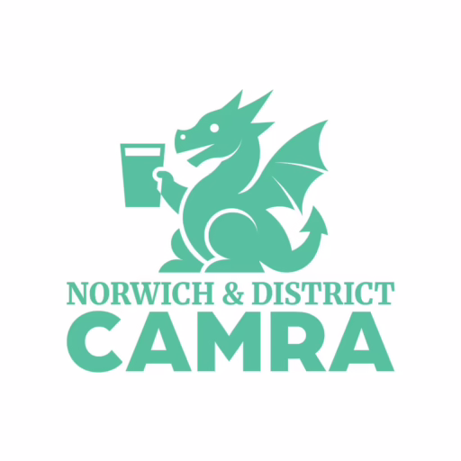
For many years the logo has incorporated a dragon, usually with a pint of ale. But why? The main inspiration comes from the Snap Dragon which has featured in the history of Norwich. A representation of a dragon was at one time paraded around the city as part of civic ceremonies, and the last version to have been so used is still on display in the city.
The Branch logo


The 1990 Norwich Beer Festival logo featured a very friendly dragon (drawn by David Read) enjoying a pint of ale, and this image was subsequently adopted (with some slight modifications) as the branch logo, above left. In 1997 we produced a pint glass with this image on it – some are still available on request! The branch logo was modified in 2019, to allow the dragon image – slightly modernised! – to be used without the wording (above, centre and right).